Parkster
Turned user confusion into a clear, guided journey by improving how Parkster communicates account types and upgrades throughout onboarding.
Role
UX design, IA, onboarding flow, prototyping
Tools
Figma
Duration
4 weeks
The Scope
This project was completed through my UX design program, focusing on improving Parkster’s onboarding and account journey. I analysed the existing information architecture to understand where users missed key account options, then redesigned the flow to reduce confusion and support smoother sign-ups and upgrades. The outcome was a clearer path from Express parking to creating an account and converting to Plus, supported by research insights and iterative prototyping.
The Problem
Parkster’s account model wasn’t clearly communicated in the user journey. Many users didn’t realise different account types existed, and “Create account” was placed so deep in the navigation that it was easy to miss. This created uncertainty about what users were signing up for, and made the step from Express to Plus feel unclear.
The Solution
I redesigned the onboarding and upgrade journey to make account choices visible early and easier to understand. By simplifying the structure and microcopy, and by guiding users with clear, low-friction steps, the new flow supports faster sign-up, stronger trust, and a smoother path from Express to Plus conversion.
Discovery
I started by mapping Parkster’s current onboarding and navigation to see exactly where users lost context and missed key account options. This created a clear baseline for what needed to change to reduce friction and support conversion.
Research Questions
How can we make it easier for users to understand the different account types?
What’s the best way to convert Express users to Plus users?
How can language influence user loyalty?
Methods
To understand the problem and validate solutions, I used user interviews, a naming survey, competitor analysis, and personas to represent key user needs and behaviours.
Competitor analysis
Parkster
Strength
- No hidden fees
- Overpayment protection with Plus
- Cost-neutral pricing model
Weaknesses
- Less engaging interface
- Weaker marketing presence
Opportunities
- With a better UI and stronger marketing, Parkster could become the first choice
Threats
- Low revenue without added fees
- Losing customers since account creation is unclear
Easy Park
Strength
- Interactive interface
- Market leader in Sweden
Weaknesses
- Extra fee per parking session
- Monthly subscription costs
Opportunities
- Media exposure increases brand awareness
Threats
- Lack of transparency about added fees
- Negative media attention
User Persona: Erik

Age: 31
Location: Malmö, Sweden
Occupation: Carpenter
Bio
Erik, 31, works as a carpenter and drives daily as part of his job. He’s used to parking apps but feels overwhelmed by the number of options — so he sticks to familiar services out of habit.
Goals:
- Park quickly and without hassle
- Be able to end parking early when plans change
- Use a solution that feels as smooth as a physical parking meter
Frustrations:
- Too many parking app alternatives to compare
- Unclear differences between account types and pricing
- Anything that slows down parking when he’s on the move
Current state audit (IA + friction)
I conducted an audit of the current state of the existing app to map where key actions lived in the navigation. The audit showed that account creation and account types were buried too deep, making them easy to miss and creating unnecessary friction in the sign-up and upgrade journey.
User journey
I mapped the current user journey to pinpoint where users lost context and missed key account information. Then I created a new, improved task flow that brings account choices earlier and guides users through clearer steps, from quick parking (Express) to creating an account and upgrading to Plus.
Information Architecture
I explored different ways to structure the journey so key actions were easier to find. The final direction reduced overwhelm by keeping the flow simple, while making account options and upgrade value clearly visible at the moment users needed to decide.
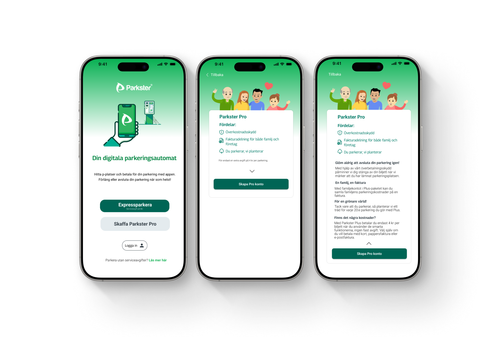
Prototypes
What I Learned
This project showed me how easily a product’s internal logic can be invisible to users. Clarity comes from structure, timing, and language, and small IA changes can reduce friction, build trust, and make conversion feel natural. Testing early helped me spot where users lost context and iterate with purpose.
