HAL
HAL is a concept-stage mental health app built around a customizable AI chatbot. The goal: to support users in forming healthy habits through a calm, structured, and intuitive digital experience.
HAL
HAL is a concept-stage mental health app built around a customizable AI chatbot. The goal: to support users in forming healthy habits through a calm, structured, and intuitive digital experience.
Role
UX/UI design, concept development, branding
Tools
Figma
Duration
5 weeks
Role
UX/UI design, concept development, branding
Tools
Figma
Duration
5 weeks
The Scope
This was a first-version design project for an early-stage mental health app. The startup behind HAL came with only a loose concept and an open brief, there were no defined features, flows, or branding. I had the opportunity to shape the direction from the ground up. Within a limited timeframe, I designed and prototyped a full mobile experience: from concept and flow to interface and tone. The work included research, visual design, prototyping, testing, and developing the app’s core interaction patterns.

The Scope
This project was a first-version design for an early-stage mental health app. HAL started with only a loose concept and open brief, with no defined features or branding. I shaped the direction from the ground up, designing and prototyping a full mobile experience within a limited timeframe, including research, UI design, testing, and core interactions.
The Problem
Many people struggle with building consistent routines, especially when experiencing anxiety, stress, or ADHD. Most productivity tools focus on performance, not how we feel. HAL’s challenge was to create a mobile assistant that helps users structure their days with empathy, not pressure.
The Solution
I designed HAL as a calm, conversational mental health companion. The app uses AI to guide users through mood check-ins, routines, and self-care, with a tone that feels more like a gentle friend than a task manager. The design reduces cognitive load through minimal UI, soft visuals, and emotionally supportive microcopy.
Discovery
With only a rough idea from the founder, a mental health app powered by AI, I began by researching the space. I looked into existing mental wellness tools, AI chatbots, and apps with emotional or reflective use cases. This competitor analysis helped me understand the current landscape and where HAL could position itself differently. To get a better understanding of what features users actually valued, I created and distributed a survey focused on mental health app expectations and habits.
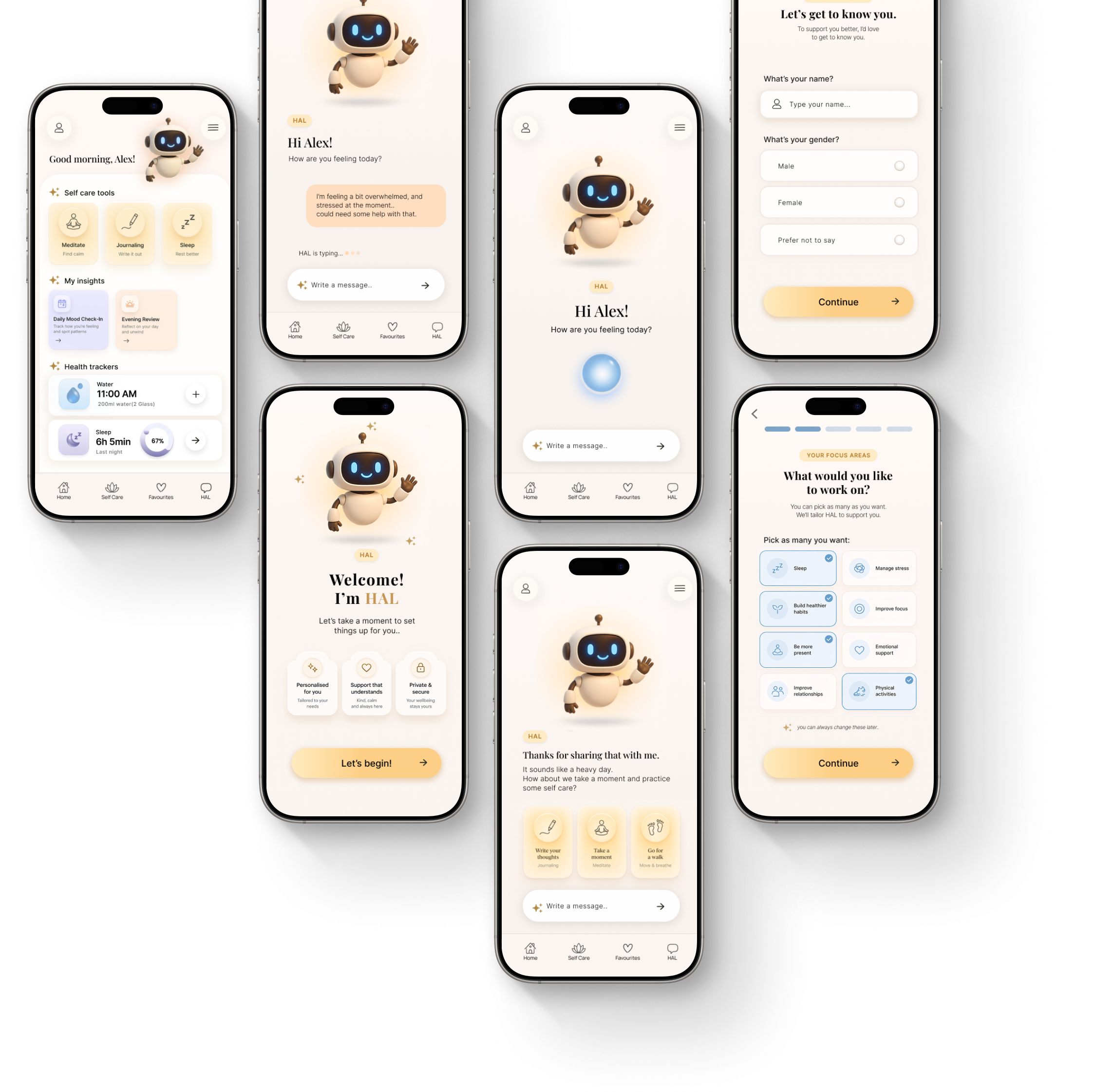
Wireframes
I started with quick paper sketches to explore layout and flow, then moved into low-fidelity wireframes in Figma. I focused on the main screens: the onboarding, the HAL conversation, and the dashboard. Widgets were removed from scope to allow more time for core flows, based on feedback from the founder.
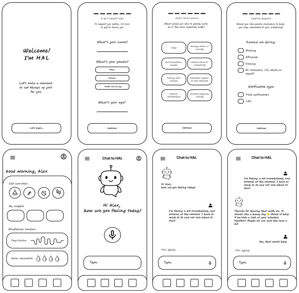
Core Features
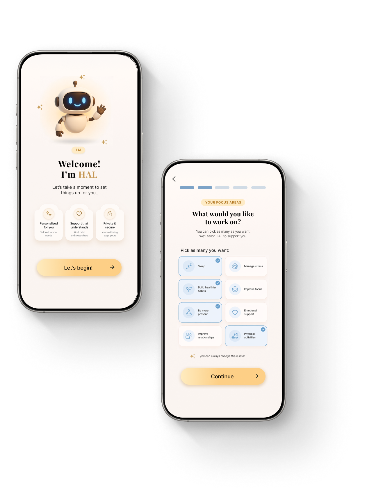
1.
Onboarding flow
A soft, four-step introduction designed to create psychological safety, personalise the experience, and set clear expectations from the start.
2.
AI chat
An adaptive conversational AI that responds to the user’s emotional state, offering reflection, support, or practical tools when needed.
3.
Active dashboard
A calm, low-pressure space for tracking moods, habits, and routines without gamification or added stress.
Branding
The interface needed to feel calm, yet approachable. I softened the original colour palette to create a more soothing tone. Typography pairs Inter for readability with Playfair Display for expressive headings. Hand-drawn style icons, created with AI tools, add a minimal and human touch. I also introduced different visual personalities for HAL, such as a cloud and a playful robot, giving users a choice in how their AI companion feels.
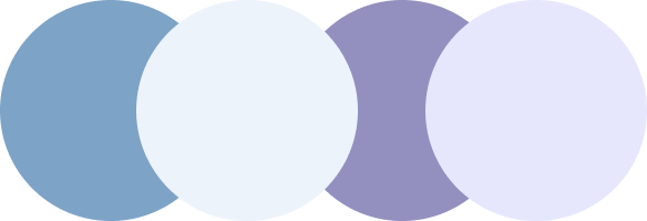
The colour palette is built around warm golden tones as primary colours to create a sense of comfort and approachability. These are supported by soft neutrals and muted cool tones, which balance the interface and introduce clarity without disrupting the calm experience.
PRIMARY & SECONDARY COLORS
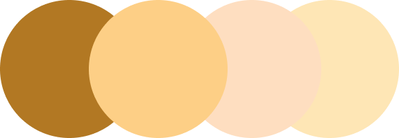
ACCENT COLORS

Branding
The interface needed to feel calm, yet approachable. I softened the original colour palette to create a more soothing tone. Typography pairs Inter for readability with Playfair Display for expressive headings. Hand-drawn style icons, created with AI tools, add a minimal and human touch. I also introduced different visual personalities for HAL, such as a cloud and a playful robot, giving users a choice in how their AI companion feels.
The colour palette is built around warm golden tones as primary colours to create a sense of comfort and approachability. These are supported by soft neutrals and muted cool tones, which balance the interface and introduce clarity without disrupting the calm experience.
PRIMARY COLORS & SECONDARY COLORS

ACCENT COLORS
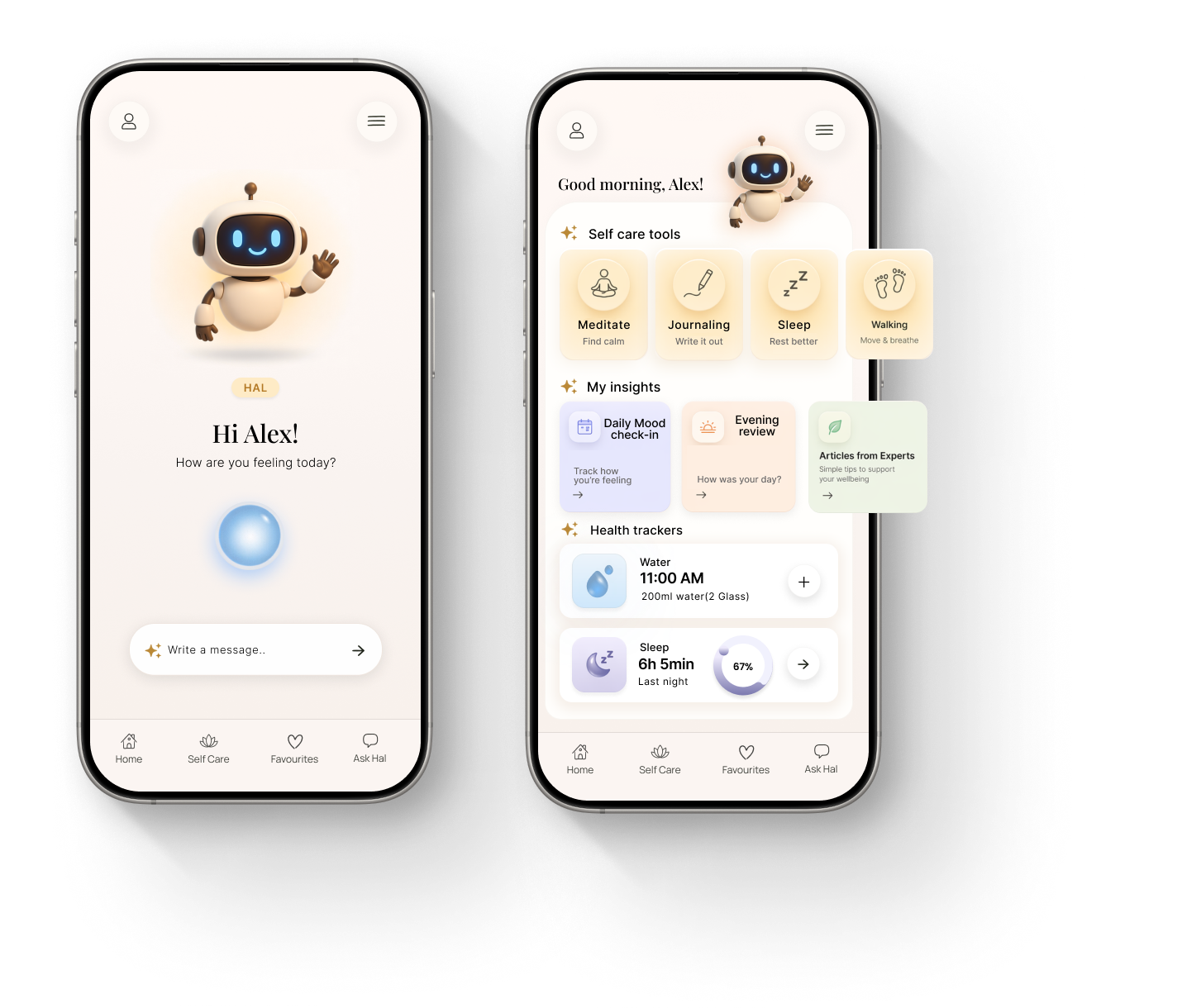
Prototype
After validating the structure in low-fidelity, I moved through mid-fidelity wireframes and into a high-fidelity prototype. The interface was refined for clarity, tone, and consistency, with focus on spacing, microinteractions, and emotional rhythm.
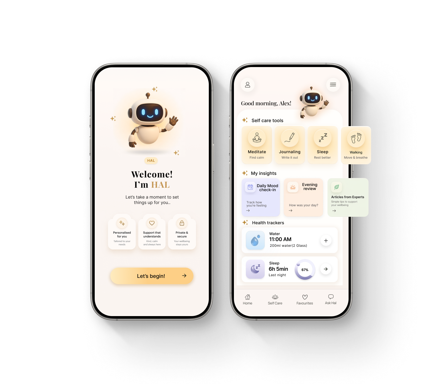
Prototype
After validating the structure in low-fidelity, I moved through mid-fidelity wireframes and into a high-fidelity prototype. The interface was refined for clarity, tone, and consistency, with focus on spacing, microinteractions, and emotional rhythm.
Validate
User testing happened in multiple stages. I tested early wireframes in person with two users and gathered remote feedback on layout and tone. A broader survey helped define user expectations, while a card sorting activity guided how features were grouped in the dashboard. Feedback led to concrete changes, like simplifying the dashboard, refining the onboarding sequence, and adding customisation options such as alternate avatars.
What I Learned
This project reminded me that open briefs are both an opportunity and a challenge. With no predefined features or structure, I had the freedom to build something from scratch, but also the responsibility to decide what mattered most. It became clear early on that designing for mental health means starting with emotion, not functionality. I learned to slow down and pay attention to tone, pacing, and visual softness, the details that shape how a product feels, not just how it works. Working on HAL pushed me to think more deeply about care in design, and how small choices can make a product feel safe, calm, and human.
