Boka.se
Redesigned the booking flow to reduce friction and increase user conversions, supported by A/B testing to identify the most effective UX improvements.
Boka.se
Redesigned the booking flow to reduce friction and increase user conversions, supported by A/B testing to identify the most effective UX improvements.
Role
UX Designer
Tools
Figma
Duration
6 weeks
Role
UX Designer
Tools
Figma
Duration
6 weeks
The Scope
This was a live UX case conducted through my design program in collaboration with Boka.se, a Swedish booking platform. I was brought in to evaluate the existing flow, identify where users dropped off, and design two improved booking journeys. I then planned and conducted A/B testing to validate which solution better supported clarity, trust, and conversion.
The Problem
Many users drop off before completing the booking process on Boka.se, despite the platform’s wide range of services. The existing flow is text-heavy and lacks clear visual hierarchy, making it mentally demanding to complete. The challenge was to redesign the experience to feel calm, clear, and trustworthy for users with varying levels of digital confidence.
The Solution
Redesigning the booking flow to feel calmer, clearer and more guided. By simplifying the structure, reducing unnecessary information and clarifying key actions, the flow supports users through each step and reduces uncertainty, without changing Boka.se’s existing design system.
Discovery
I analysed the existing booking flow through usability testing and heuristic review. The issue wasn’t the booking itself, but the uncertainty users felt when moving forward, especially on mobile. Confusion around account creation and unclear calls to action created unnecessary friction. A focused persona helped guide the redesign toward clarity, reassurance, and ease.

Persona: Maj-Britt
Maj-Britt is a 68-year-old retired nurse in Sweden who values clarity, structure, and reliability. She uses digital services when they feel simple and predictable, but becomes overwhelmed by complex or cluttered interfaces. When booking online, she wants clear pricing, obvious next steps, and reassurance that her booking is confirmed. She is frustrated by text-heavy flows, unclear buttons, too many choices, and inconsistencies between mobile and desktop experiences.
Research & Methods
To inform the redesign, I combined qualitative insight with structured evaluation. Usability testing of the Boka.se demo revealed moments of hesitation and drop-off, while a cognitive walkthrough exposed gaps in clarity from a first-time user perspective. A heuristic review highlighted issues in visibility, feedback, and hierarchy, and competitor analysis uncovered industry expectations around booking flows. A brief SWOT analysis helped frame these usability findings within the product’s broader strengths and opportunities.
Pain Points
1.
Unclear next steps
Users are not always certain what action will move them forward in the booking process. This hesitation interrupts the flow and reduces confidence in completing the task.
2.
High cognitive load
The interface presents a large amount of text and information at once. On smaller screens, this increases mental effort and makes the process feel more overwhelming than necessary.
3.
Weak visual hierarchy
Primary actions do not stand out clearly from secondary content. When important buttons blend into surrounding elements, users may overlook them or question whether they are interactive.
4.
Uncertainty at the final step
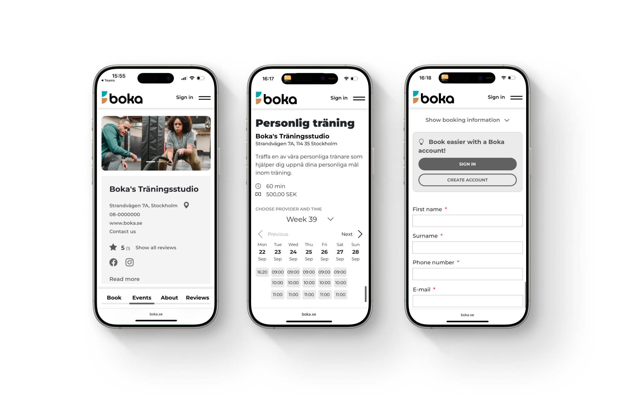
When users reach the details form, the message about creating an account is presented in a way that looks mandatory. This creates hesitation and causes some users to stop, believing they can’t complete the booking without signing up.
Pain Points
1.
Unclear next steps
Users are not always certain what action will move them forward in the booking process. This hesitation interrupts the flow and reduces confidence in completing the task.
2.
High cognitive load
The interface presents a large amount of text and information at once. On smaller screens, this increases mental effort and makes the process feel more overwhelming than necessary.
3.
Weak visual hierarchy
Primary actions do not stand out clearly from secondary content. When important buttons blend into surrounding elements, users may overlook them or question whether they are interactive.
4.
Uncertainty at the final step
When users reach the details form, the message about creating an account is presented in a way that looks mandatory. This creates hesitation and causes some users to stop, believing they can’t complete the booking without signing up.
Ideate & Design
I started with hand-drawn sketches and low-fidelity wireframes to explore alternative booking structures. Two distinct approaches emerged: one focused on speed and efficiency, and one focused on clarity and guidance. These early explorations helped clarify which elements needed to be prioritised and how information could be structured more intuitively on mobile.
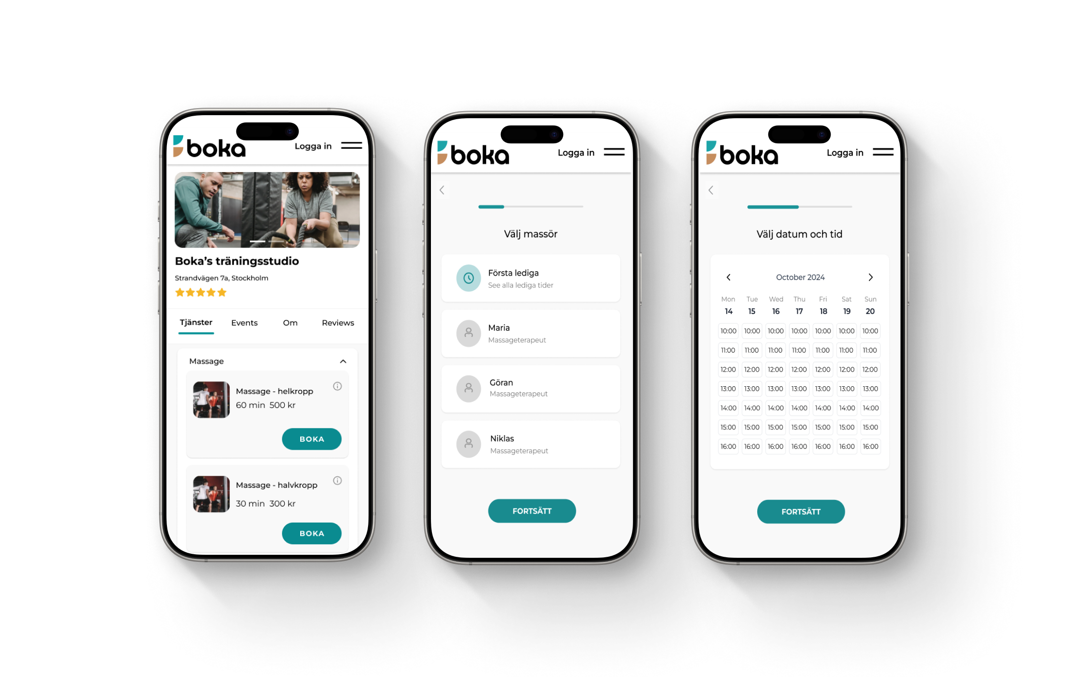
Prototype
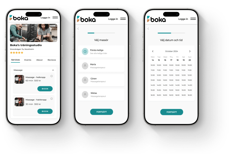
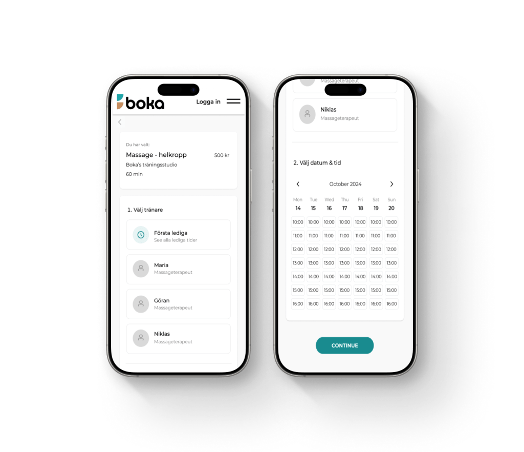
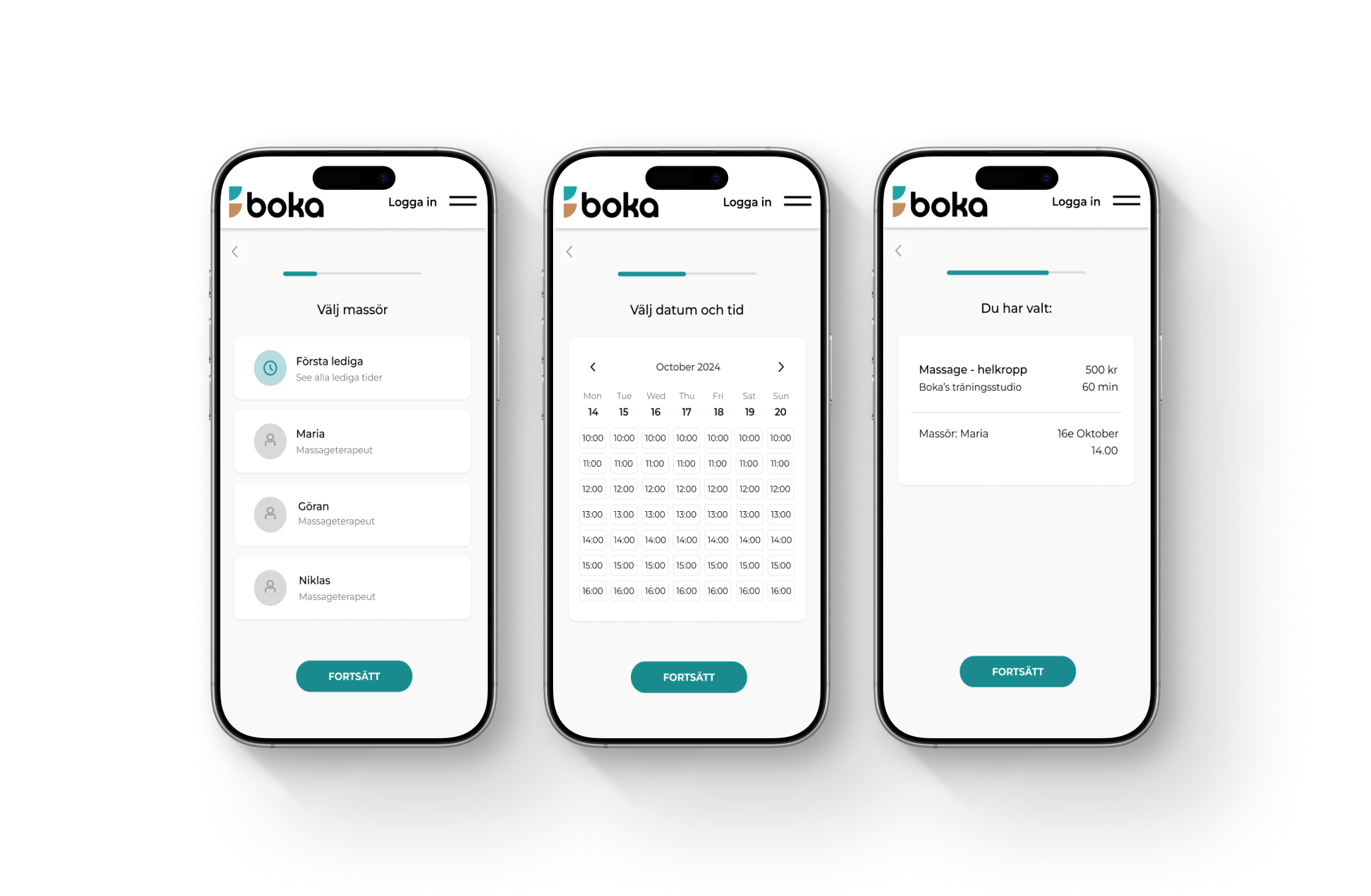
Two interactive prototypes were created in Figma using Boka.se’s existing design system. Prototype A: A single-page flow where all booking steps are visible at once, prioritising speed. Prototype B: A step-based flow with a progress indicator, guiding users through the process one step at a time.
Prototype
Two interactive prototypes were created in Figma using Boka.se’s existing design system. Prototype A: A single-page flow where all booking steps are visible at once, prioritising speed. Prototype B: A step-based flow with a progress indicator, guiding users through the process one step at a time.
Test & Iterate
An A/B test was conducted with six users aged 72–78. Participants were asked to complete a booking while thinking aloud. Most users preferred Prototype B, describing it as calmer, clearer and easier to follow. Prototype A was perceived as faster, but more overwhelming due to the amount of information presented at once.
What I learned
This project reinforced how small structural decisions can have a significant impact on user confidence. Clear progression, reduced cognitive load and visible feedback proved more important than speed alone in a critical flow like booking. It also highlighted the value of validating assumptions through testing, even subtle changes in hierarchy and guidance can meaningfully improve completion and trust in digital services.
